Shaping Kordiam Together: Recent UI Updates and What’s Next
Feature Announcement
2 minutes read
At the end of September we rolled out the first batch of changes to the user interface and lots of users have provided us with useful feedack.
In a second step we have been rolling out these changes across the entire application and - more importantly - we have revised some key elements based on your input.
Improvements to the user interface
The following are just a few examples of the changes that came out with the new version (1.77):
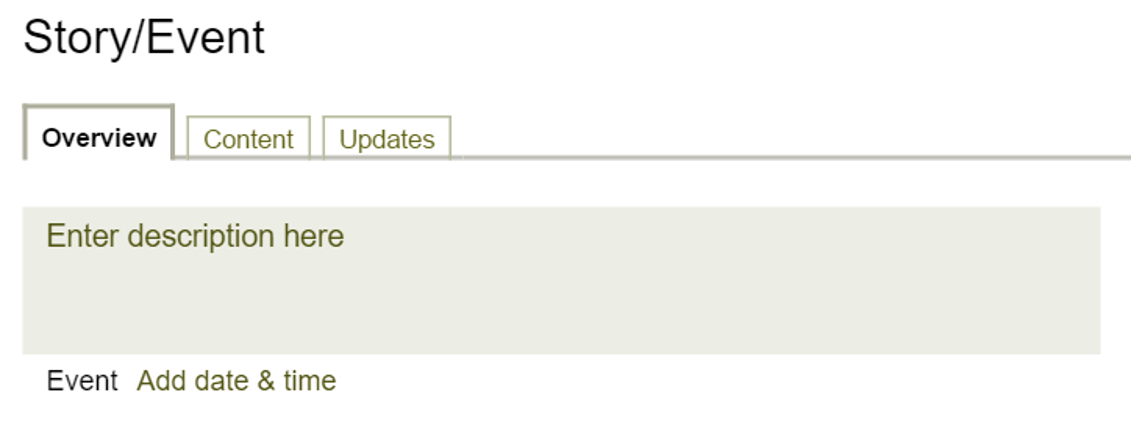
- Larger story description field: We increased the clickable area for the story description to a minimum of three lines. This allows you to more easily enter and edit the description.

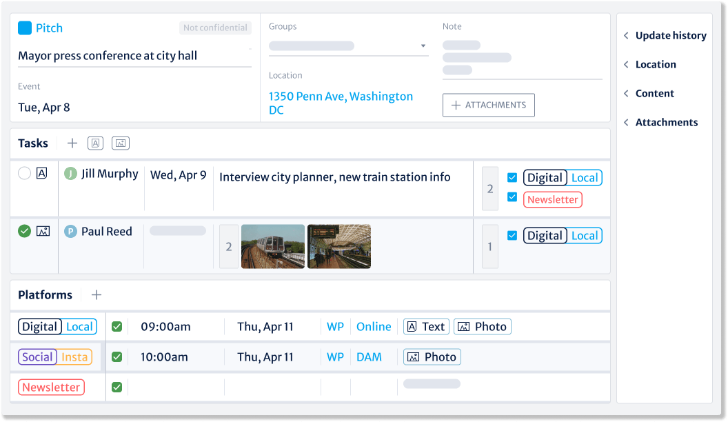
- Larger task note: We increased the available space for task notes.
- Better readable dates: On the entry mask we have included the weekday in the dates for better readability.

Outlook 2016
The changes we have made to the user interface over the last few months have cleaned up Kordiam's look. This provides the basis for many improvements we plan to deploy in 2016. These are some of those improvements:
- Custom statuses: You will be able to define your own status levels instead of relying on the pre-defined ones such as Accepted or Proposal.
- Mobile: At the end of December we have started coding the web app that will allow you to use Kordiam even better on the go.
- Integrations: We plan to enable easy-to-deploy integrations with tools such as WordPress or Slack.

